Saturday, January 16, 2010
RIP two of my fave design mags
Now two of my favorite design magazines have folded. I am especially crushed over the demise of Metropolitan Home. I have been reading its glossy pages literally since its infancy back in the 80s when it was merely known as "Apartment Life."
Sure, there's still Dwell, Elle Decor, Home & Garden, and even Atomic Ranch, but for me, I don't think they will ever be able to match the allure, excitement or anticipation that MH held when I'd see a brand new edition in my mailbox. *sigh*
Sunday, March 29, 2009
Calgon take me away!
However, lately I'm really drawn to those deep new standalone tubs, big enough for you and an army of friends; but I also like the ideal and aesthetics of Japanese soaking tubs, those narrow but deep tubs made just for that - soaking your cares away. There are many gorgeous styles out there, and I'm really digging this in-ground version.
Well today, I happened upon THIS.
WOW. Talk about your bath perfection.
A standalone tub. Japanese style. Simple elegant hardware. Beautiful woodwork. Huge ceiling-mounted rain showerhead.
AND WILL YOU LOOK AT THAT SETTING, people!
Absolutely stunning.
I'm not a bath gal, but if I were, I might never leave that tub.
Friday, January 23, 2009
Too much is just too much
My favorite group, U2, says "Too much is not enough." Well in this case, too much is just that—too much. This is what I mean when I talk about the typical "
you got your Horchow
And
http://www.kirklands.com/s-17-in-stores-only.aspx
And Hemispheres
http://www.hemispheres-us.com/
And Ashley
And World Market
And The Arrangement
http://www.thearrangement.com/access.html
Restoration Hardware
Even Homegoods, TJMaxx, Marshalls and Ross fall into this category much of the time.
http://openhouse.homegoods.com/index.php/finds/
Thankfully, the city is salvaged by places like Bova, Roche-Bobois, DWR, West Elm, Ligne Roset, Z Gallerie, Crate & Barrel, Eurway, Cantoni, Scott+Cooner, not to mention the whole Knox-Henderson area and the Dallas Design District (although I have noticed that some of their websites are so tiresomely outre, they can make one feel—as Decorno would say—stabby). Stop with the Flashy madness, people, and just give us the goods!
Wednesday, January 14, 2009
My fasc with glass
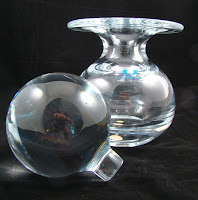
Case in point, my own photo set on Flickr featuring my favorite artist, the ultimate guru of glass, Dale Chihuly. Of course he has his own site here. What that man can do with blob of molten silica is beyond astonishing. That he does it with only one eye (from a car crash years ago), is even more amazing (try covering one eye and driving some time). Another favorite is Blenko glass, ubiquitous and cheap in the 40s-60s, now coveted by collectors, including me. Here are a few bright and shiny glass tidbits of interest. Click on any picture to enlarge:
Wallpaper 2009 Design Awards
And even though this didn't take first prize, as one of the runners up, this particular home in Chile - the House of Eleven Women - is absolutely AMAZING. While the house itself is absolutely stunning, the setting makes the house even more amazing: one side overlooks the hills of the city, the other overlooks the ocean. Talk about a win-win.
However what really fascinates me is the fact that this family has eleven daughters. ELEVEN, people. That's one more than ten. Either they kept trying for a son really really hard, or they were simply blessed with lots of hormonas de feminina. Either way, I would LOVE to hear what the father/husband has to say about all of his girls, and having to live amongst all that estrogen! Hope that fancy house of theirs has a "man cave" in which he can lock himself into when need be. LOL!
I enjoyed the comments about Kanye after the AT article. I wholeheartedly agree. Wallpaper circulation must be way down.
However...I found this very interesting tidbit of information:
"Here's news to us: West studied fine art at the American Academy of Art in Chicago on scholarship. He collects pop art. And he absolutely adores design.
"It's been my dream to be in Interior Design." O_o With that unsolicited introduction, he steps into his Los Angeles house for a portrait session, fresh off a transatlantic flight from the Concert for Diana. Without missing a beat, he's ready to pull out his laptop to preview a music video in the works with Takashi Murakami, then talk renovation with Desiderata Design principal Don Stewart."
Monday, January 12, 2009
Hark! A glimmer of hope in Dallas!
Sputnik Modern
Collage
Jan Showers gives a bit of a happy medium between the modern shops and the more traditional shops:
Jan Showers & Associates
These Dallas stores tend to be famous for the what I call the typical "Dallas look:" very traditional, lots of flourishes, too much ornateness and gilding, and Bombay store-esque "exoticness." Clean lines? Modern sensibilities? Not so much. But the look is something that seems to be ubuiquitous here in Dallas:
Urban Electric Co.
Ceylon et Cie
East & Orient Company
Sunday, January 11, 2009
Oooh, me likey.
*gaaaahhhh* (incoherent drooling noises)
then I found this:
WOW. (I think the fun fabric really adds to the whole effect)
I also saw this one as well (but that ghastly fabric has got to go!) *shudder*
Milo Baughman's chrome rocking chair and matching footstool (which also rocks!). Simplicity of form, function, and comfort. Ah, bliss. I think if I had one of those, my kiester would undoubtedly never leave it!
And I reeeeeeally want these chairs for my dining room, also by Milo Baughman, love the brown velllllllvet:
or these interesting chairs by Paul McCobb. I can't tell if that's the original fabric on the seats, but it's cute and whimsical, I like it!
And what's up with this thing?
It's like the Willy Wonka of "MSM Chrome Furniture Land", with all those crazy curlicues! Frankly, it looks like one good rock in that thing would launch you backward off that baby so fast, you wouldn't know what hit you!
Friday, January 9, 2009
Those after Christmas sales!
First we have Z Gallerie, over by the Galleria, which has its own version of this Eames style chair:
As well as these great side chairs (love the zippi-dee-doo-dah zebra stripe!):
Love this fun, sexy mirrored coffee table as well:
Then we have these little lovlies from CB2 (the younger, hipper sister of Crate & Barrel), one of my favorite on line stores (Mama may just have to go off the wagon for some of these babies, because at these prices, they won't last!).
Thursday, January 8, 2009
Time for another eBay watch
HAPPY NEW YEAR....say it with COLOR!
So let's start off the new year with a bang - COLOR! My new favorite decor blog is Decorno. LOVE. HER. She mentioned the website for LS Fabrics, which has a sister website called StaceAge, located in Atlanta.
Now, I’m not that much into Hollywood Regency, but OMG. I think I could be swayed (or is that suede?) when I happen to see amazing pieces like these. Look at this luscious blue foot stool, gaaaahhh! And the lovely blue and white chaise with the subtle outline...of an AK-47. That's pleasant.
And these:
And THIS! *drool* gaaahhhhh....fit for a diva! All it needs are some string curtains and a white flokati rug!
Doggone it, this makes me go woof! with its cute little fire hydrant applique!
Man. All that color is TOO stinkin' cute!
Tuesday, December 23, 2008
The unknown reindeer!
http://www.dogwork.com/dogsnow/
Wednesday, October 22, 2008
Shout out: ENVIROGLAS!
In their own words: "EnviroGLAS converts post-consumer and industrial glass bound for the landfill into elegant, sustainable and ecological hard surfaces and landscaping materials."
EnviroGLAS recycles some of the surplus of old/used glass bottles, mirrors, windows--even toilets!--that would typically simply be dumped into a landfill, and turns them into a new source for kitchen counters, bathrooms, and that classic flooring material, terrazzo. Based in
The company has been around for several years, and their product "EnviroPLANK" was recently featured on HGTV's "I Want That." Personally, they are the company I plan to go to if and when I decide to build a house!